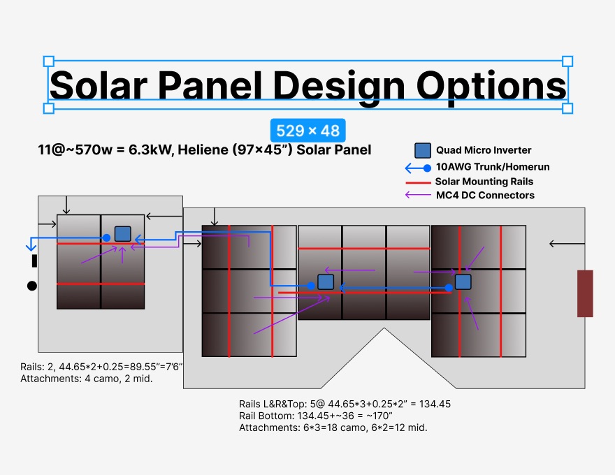
Note: Updated to new design! See at bottom of this page.
I put solar panels on my house today… at least in a design mockup. This is an email I was writing to my family and friends and then realized I had wasted spent so much time on it, perhaps I should make a blog post rather than fill their inboxes.
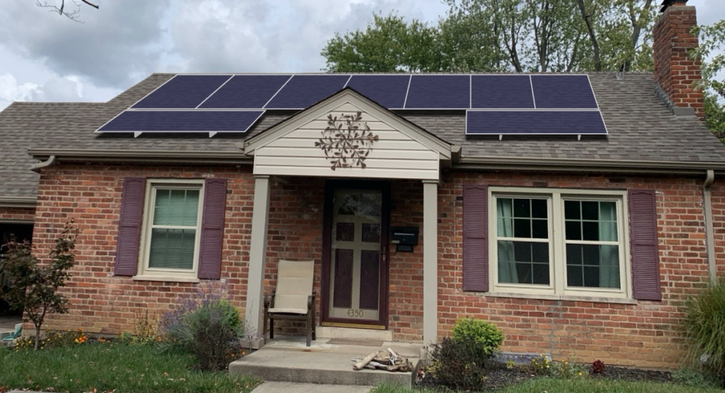
I’m sharing because I’m super impressed with my (graphic) work. I really wanted to be able to visualize my top design option (of hundreds?). I had to manually do all the perspective, masking, shadowing of all the panels individually after wasting time trying to find a better tool.
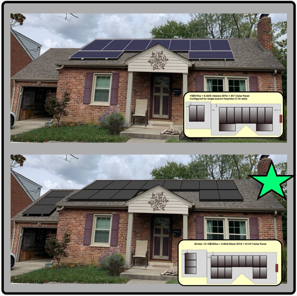
It is almost realistic and much better than what I have been working with:
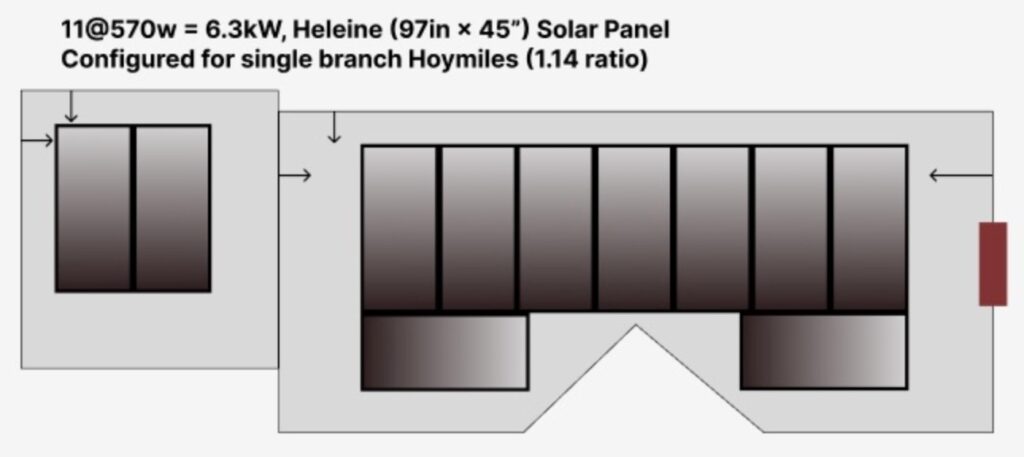
These are very large commercial panels about the size of a sheet of plywood. As such they are only available with the silver aluminum frames and blueish color. Unfortunately, now that I have created this “realistic” view, I can get a feel for how this would look if I got the “all black” residential panels.
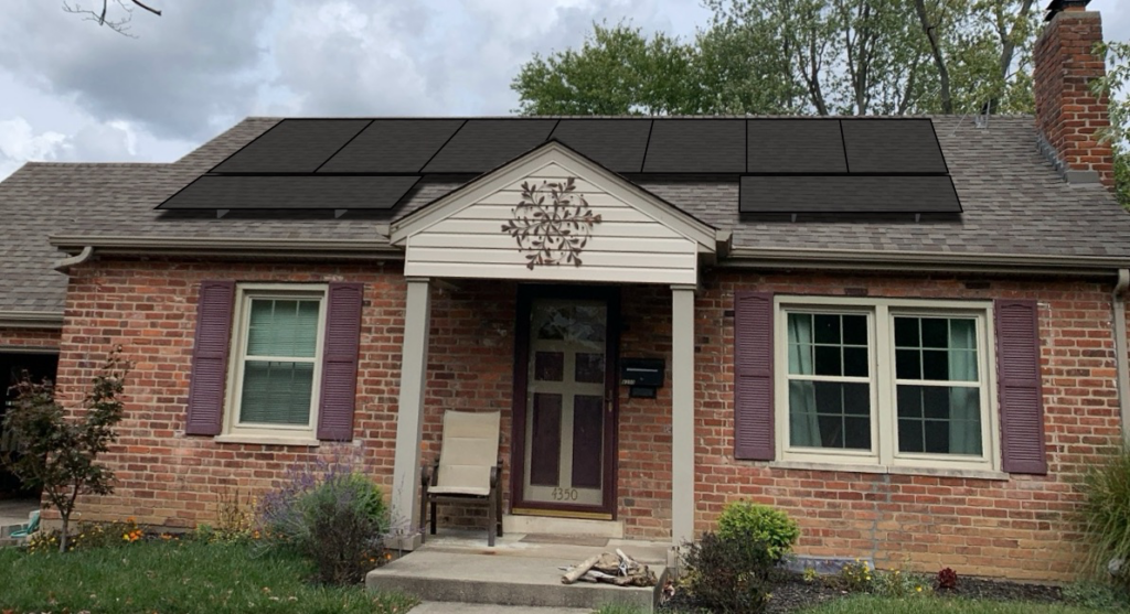
Damn!!, that looks more pleasing… not an option though in this 6+kW design.
Hopefully, I’ll wake up tomorrow and go with the above design.
Eric
PS: Oh no wait, another decision! Should I move the array to the West (left) to have less shading from the chimney and trees?????? Less aesthetically pleasing but more power generation!
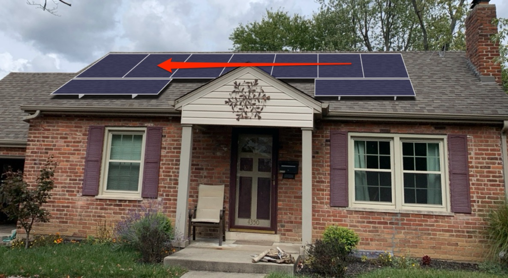
Yes, I have actually considered this and my guess is few people would actually notice, but once you see it, you can’t unsee it. And it looks wrong (except for by a solar purist I guess, lol) The centered layout has already been partially optimized for shading by making the top-right panels portrait which will allow them to be more productive under partial shading than if they were landscape. (See bypass diodes)
I’ll climb on the roof later today and verify my measurements then tomorrow hopefully end the design phase of this project…
I'm having a really hard time sending this email.
I keep going back to look at that all black version. It looks really good!
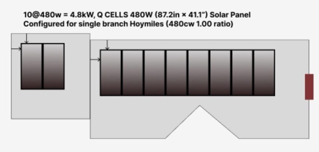
Here is a 4.8kW version that I may be able to do in black:
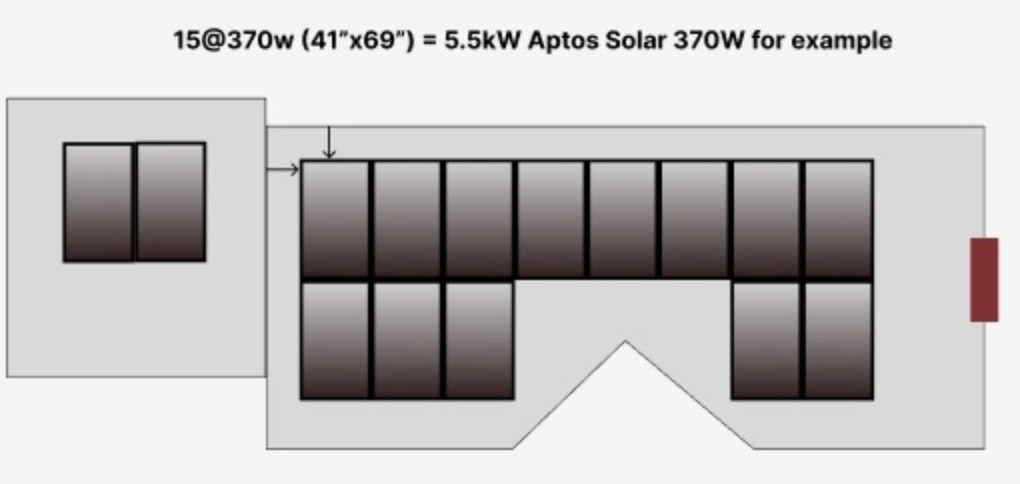
Or a bit more complexity with a 5.5kW version that definitely seems worth considering.
And yes, I could add another panel on the garage and be still within my simplified “single 30A trunk line, no combiner box needed” original design. But then I would need to turn those portrait like:
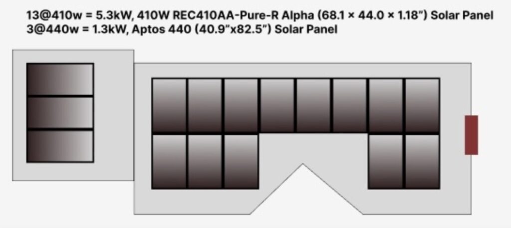
This would get me up to 5.9kW (using the 370w panels) AND have the nice “all black” look (but probably also a bit more degradation under high heat). Also, if I’m willing I could possibly source slightly larger black panels for the main house and use a different but larger panels on the garage (as shown) and get back up to the 6.5kW power as my first design.
Oh wait, but I have lost my symmetry…
Check back later for my “best” all black option, and remember:
Perfect is the enemy of Good!
(Hopefully final) UPDATE
Okay, I said check back later and here we are just 1 day later and I have decided to go with the “All Black” because is looks so much better. Also, even though the array power is about 10% less, 5.8kW versus 6.4kW for super large commercial panels, the cost is expected to go UP. That is because with 16 panels for the “All Black” versus 11 for the commercial array, there is more connection hardware and more electrical equipment like micro-inverters and wire.
I’m still able to do a single 30A 10AWG home run cable that will keep the system relatively simple, but not as simple as the commercial array.
Next Steps
I’m still not really at the starting line yet. I’ll need to review my plans, source new panels, price out full project, then move forward with updated “professional” documents and structural analysis. Stay tuned.
