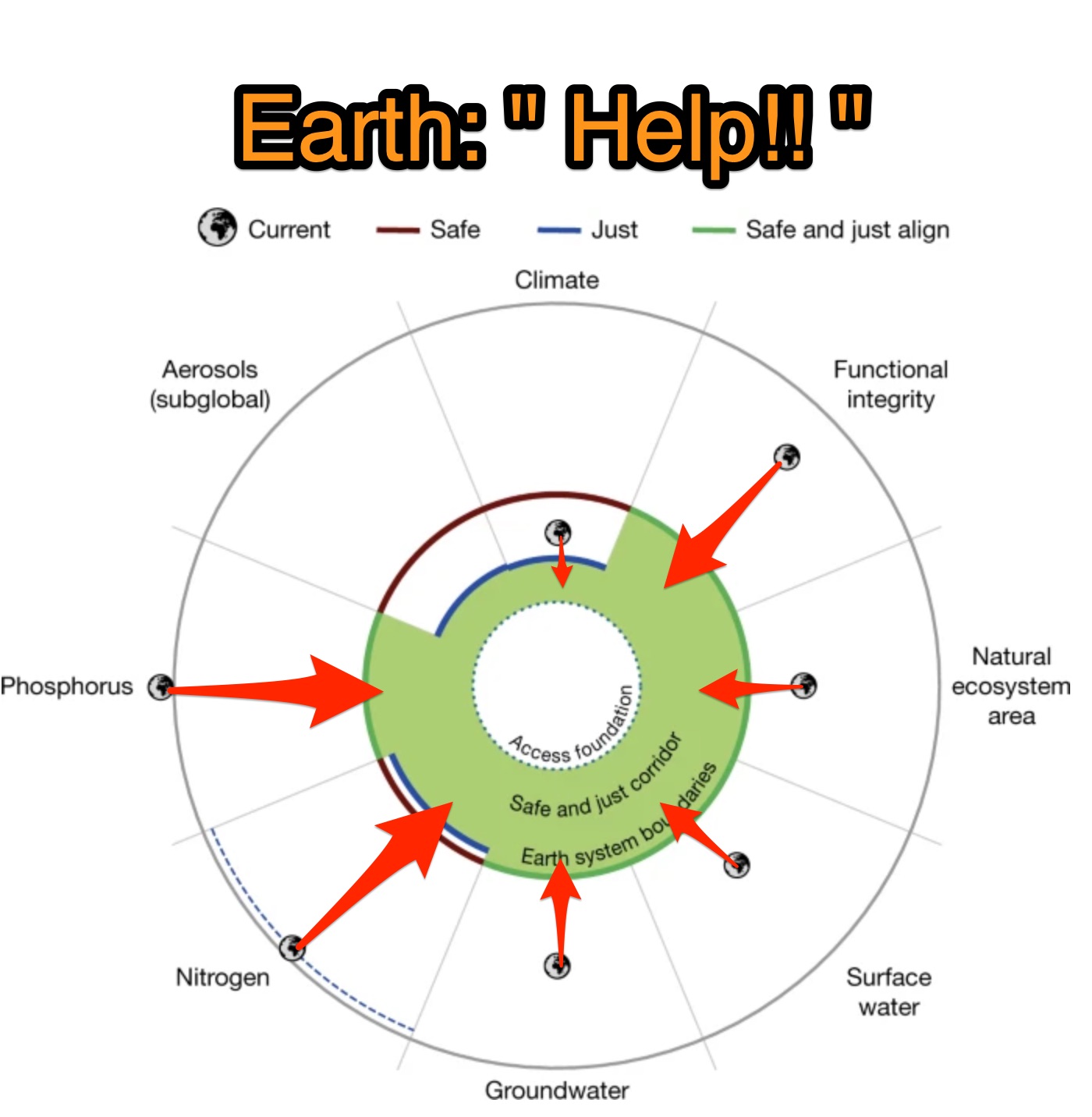
Today, I can across some references to a recently published paper in Nature entitled, “Safe and just Earth system boundaries.” The paper seems in line with why I created this website, so I decided to check out the primary source. After hours of trying to distill it, I’m left frustrated.
My take on this article is that the authors went through great pains to be analytical and scientific in their investigations. The article has 133 scholarly references and was contributed to by over 40 top authors and affiliated groups. To me, it is very confusing. Perhaps I am too far outside the target audience, but I would have hoped for a clearer presentation.
The articles purpose
The authors identified 8 “Areas of Concern” (my words) which they call “Proposed safe and just (NSH) ESBs.” This labeling and organization is just confusing!
First of all, let me spell out the abreviations even though they are of little help in comprehended this mess. NSH is “no significant harm.” ESB is “Earth System Boundary.”
For each of these 8 Areas of Concern, they measure a rating. For example, the first Area of Concern is: Global mean surface temperature [increase] since 1900, which they label as “Climate.” We are currently at +1.2 ℃. Then they try to indicate 2 limits to this measure: “Safe” and “Just.” Staying under the “Safe” limit gives the Earth a chance to survive without catastrophic changes. Staying under the “Just” limit seems to indicate that the Earth has a chance to survive with only some harm caused by the change.
For 6 of the 8 Areas of Concern, the 2 limits (Safe and Just) are the same. So, this additional complexity just adds further to the confusion. I feel it may be political in that for “Climate” area, the data shows we are between the two limits. This gives an indication that there is still hope, but we are in serious trouble. They did not want to just use a single limit where readers would either say the Earth is fine or the Earth is beyond hope. Neither of these is helpful because the global temperature IS GOING TO CONTINUE TO RISE, and we must do everything possible to limit the damage.
The article further confuses things by having the 2 limits labeled as “Safe ESBs” and “Just ESBs.” So the name of the measures can be easily confused with the values (measurements).
There is discussion of local versus global, but I’m going to skip that because it just further complicates the article and makes it even more incomprehensible. I realize that this is an absolutely critical concept because the distribution of a problem greatly changes the global impact. The Earth can handle some pollution spread globally, but if it were all in a limited area the impact could be tremendous.
My thoughts
I know that I have not really helped by writing this especially since I have such a small audience. What to do?
Anyway, as I see it we are screwed! The data shown indicates every area is in deep shit. But, perhaps we are even more screwed because we cannot present this data in a meaningful way! Enough said…
Best Overview of this Paper
The best overview of this article I could find was from the Guardian entitled “Earth’s health failing in seven out of eight key measures, say scientist.” It is worth a read. This well written and mostly understandable article helps, but I’m not sure if conveys the level of trouble we are in. I do like the quote they included from one of the papers lead authors:
“We have reached what I call a saturation point where we hit the ceiling of the biophysical capacity of the Earth system to remain in its stable state. We are approaching tipping points, we are seeing more and more permanent damage of life-support systems at the global scale.”
Prof Johan Rockström – https://en.wikipedia.org/wiki/Johan_Rockström
A more positive quote is also included from David Obura:
“There are a number of medicines we can take, but we also need lifestyle changes – less meat, more water, and a more balanced diet,” he said. “It is possible to do it. Nature’s regenerative powers are robust … but we need a lot more commitment.”
I was able to find a short interview on YouTube, with David. Sadly, I was only the 10th person to view this video.
